
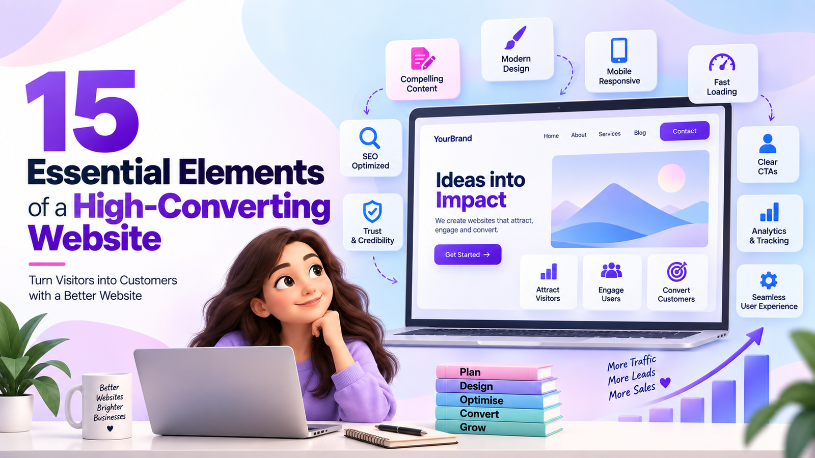
A website is more than a digital brochure. It is often the first interaction a potential customer has with your brand—and, in many cases, the place where they decide whether to contact you, request a demo, make a purchase, or leave.A visually attractive website can create a strong first impression, but design alone doesn’t guarantee conversions. A high-converting website combines strategic messaging, intuitive UX/UI, compelling content, trust signals, strong calls-to-action (CTAs), performance, and a frictionless user journey.Whether you are building a new website or improving an existing one, here are 15 essential elements that can turn your website into a stronger conversion engine.
Visitors should understand what your business offers and why it matters within a few seconds of landing on your website.
Your value proposition should answer three questions:
Instead of a generic headline such as:
“We Deliver Digital Solutions”
use a more specific message:
“Performance Marketing That Helps B2B SaaS Companies Generate Qualified Leads.”
A strong value proposition immediately communicates relevance and gives visitors a reason to continue exploring your website.
The hero section is the first major visual area users see without scrolling. It should quickly communicate your offering and guide visitors toward the next action.
A high-converting hero section typically includes:
For example:
Headline:
Grow Your Business With Data-Driven Digital Marketing
Subheading:
From SEO and content to paid campaigns and lead generation, we build strategies designed to turn traffic into qualified opportunities.
CTA:
Book a Free Consultation
Avoid overcrowding the hero section with too many messages, animations, or competing CTAs.
Your visitors should never have to wonder what they should do next.
A CTA tells users what action to take, such as:
Instead of:
Submit
consider:
Get My Free Consultation
Instead of:
Learn More
consider:
Explore Our Services
Your CTA should communicate the value of taking the action, not simply describe the button functionality.
Complicated navigation can cause visitors to abandon your website before finding the information they need.
A good navigation structure should be:
For a typical business website, navigation might include:
Home | About | Services | Industries | Case Studies | Blog | Contact
Use descriptive labels instead of vague or overly creative terminology.
For larger websites, dropdown menus, mega menus, breadcrumbs, and internal search can help users find information more efficiently.
A significant portion of website traffic comes from smartphones. A website that looks great on desktop but performs poorly on mobile can lose potential customers.
Your website should adapt seamlessly to:
Pay particular attention to:
Don’t simply shrink the desktop version. Design the mobile experience around how users actually interact with smaller screens.
Visitors are generally more interested in what your product or service can do for them than in a list of features.
For example:
Feature:
“Automated lead nurturing”
Benefit:
“Automatically engage prospects and move them closer to conversion without manually following up with every lead.”
A strong website should connect:
Feature → Benefit → Business Outcome
This makes your messaging more persuasive and helps visitors understand the practical value of your offering.
People are more likely to take action when they feel confident about your business.
Trust signals can include:
For example:
“Generated 3X more qualified leads within six months.”
If you use statistics or performance claims, make sure they are accurate and can be substantiated.
Potential customers often ask themselves:
“Has this company successfully helped businesses like mine?”
Testimonials and case studies help answer that question.
Design influences how visitors perceive your brand and interact with your website.
A professional website should have a consistent visual system covering:
However, good design isn’t about adding more visual effects.
The goal is to create a design that supports usability and conversion.
Use visual hierarchy to make important information stand out and guide users toward key actions.
Website speed has a direct impact on user experience. Slow-loading pages can increase abandonment and reduce engagement.
Common factors affecting performance include:
A visually impressive website is of limited value if visitors leave before the page finishes loading.
Not every visitor should be sent to your homepage.
Dedicated landing pages are particularly useful for:
A good landing page typically has:
Ad/Content → Relevant Landing Page → Clear Value Proposition → Proof → CTA → Conversion
The messaging between the campaign and landing page should remain consistent.
For example, if your advertisement promotes a free SEO audit, the landing page should immediately focus on that offer rather than asking users to explore your entire website.
Forms are often the final step before a visitor becomes a lead.
But asking for too much information can discourage users from completing the form.
Instead of asking for 12–15 fields, determine what information you actually need.
For an initial B2B consultation, you may only need:
You can collect additional information later through qualification or sales processes.
Content helps visitors understand your expertise, evaluate your solution, and make informed decisions.
A conversion-focused website should contain content such as:
Your content should address the questions visitors have at different stages of the buying journey.
Focus on education and problem awareness.
Help users evaluate possible solutions.
Provide evidence, differentiation, pricing information where appropriate, and clear conversion opportunities.
A website needs to be discoverable before it can generate organic conversions.
SEO should be considered during website planning—not added as an afterthought.
Important elements include:
Think beyond individual keywords.
Your website should create topic clusters and useful content journeys that demonstrate topical relevance and help users move naturally from informational content to commercial pages.
You cannot effectively optimize what you don’t measure.
A high-converting website should have appropriate analytics and tracking implemented.
Important metrics may include:
| Metric | What It Tells You |
| Traffic | How many visitors reach your website |
| Engagement | How visitors interact with your content |
| Bounce/engagement signals | Whether pages are holding attention |
| Conversion rate | Percentage of visitors completing a desired action |
| Form submissions | Number of leads generated |
| CTA clicks | Effectiveness of calls-to-action |
| Landing-page conversion rate | Performance of campaign pages |
| Traffic source | Where visitors come from |
| Cost per lead | Efficiency of paid acquisition |
Tools such as Google Analytics 4, Google Tag Manager, and your CRM can help connect website activity with marketing and sales outcomes.
The objective isn’t simply to generate more traffic.
It is to understand:
Traffic → Engagement → Conversion → Lead Quality → Revenue
Perhaps the most important element is how all the individual components work together.
A high-converting website should create a logical journey:
Discover → Understand → Trust → Evaluate → Act
For example:
A visitor arrives through Google, social media, an advertisement, or a referral.
The hero section immediately explains what your company offers.
The visitor reviews your services, product features, benefits, and content.
Testimonials, case studies, client logos, and results reduce uncertainty.
The visitor reviews pricing, FAQs, comparisons, or detailed product/service information.
A clear CTA encourages the visitor to book a meeting, request a quote, start a trial, or submit a form.
This journey should feel natural rather than forcing visitors toward a conversion before they have enough information.
Accessibility should be part of your website design and development process.
Consider:
An accessible website can provide a better experience for a broader range of users while also encouraging cleaner information architecture and usability.
A high-converting website isn’t created by adding a few attractive buttons or redesigning the homepage. Conversion optimization is a combination of strategy, UX, content, design, technology, SEO, analytics, and continuous testing.
The 15 essential elements are:
The key is to view your website not simply as a collection of pages, but as a digital customer journey designed to help the right visitors find information, build confidence, and take meaningful action.
A beautiful website may attract attention. A well-structured website can turn that attention into engagement, leads, customers, and revenue.